Long Island Sound Water Quality Over the Years: The Creeping Black Blotches
To check myself in my belief that the Long Island Sound Program was overstating things when it asserted that that water quality in the Sound was improving, I clicked through the water quality maps (annual and monthly) on the Connecticut DEP website and chose the ones that seemed to show water quality at its poorest. Admittedly, looking at the worst-case situations is only one way of judging the health of an estuary, but I think it’s as legitimate as any. (The maps are all here, you can see for yourselves whether my choices were fair.)
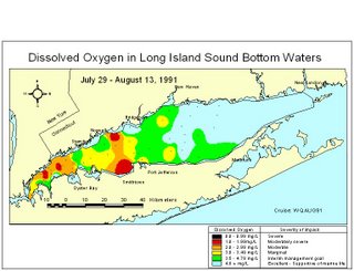
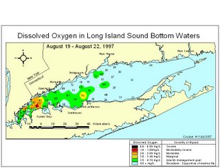
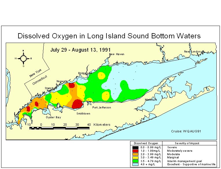
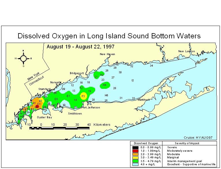
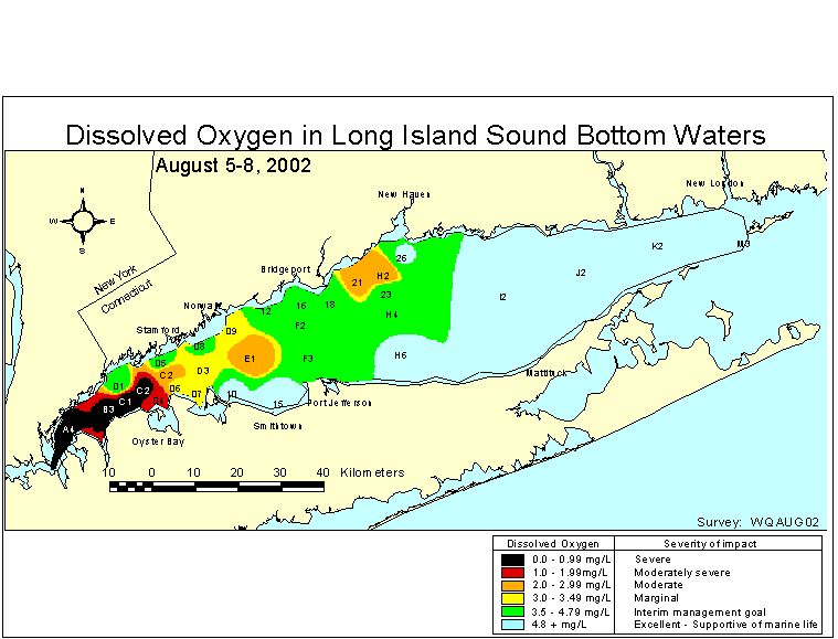
On the maps, the worst water quality is shown in black, next worse is red, then orange, yellow, green, and blue.
In the first three years – 1991, '92 and ’93 – there’s no black and only a bit of red. A small amount of black shows up in 1994, and the red area has grown. In 1996, there’s no black and only a little red.
1997 was a good year but red and black return in ’98, and in ’99, 2000 and 2001 the red area is extensive.
But then look at 2002 through 2005 – on each map the black area dominates the waters between Nassau and Westchester counties, and moves into the waters off Fairfield and Suffolk in some years.
It’s hard for me to look at these maps, which are essentially snapshots of the Sound at its worst, and conclude that water quality is getting better. But if someone wanted to tell me I don’t’ know what I’m talking about, I’d listen.
Here's a sample of the maps, from 1991 through 2005 (click on each map to make it bigger):


posted by Tom Andersen at 2:08 PM
![]()
![]()


0 Comments:
Post a Comment
<< Home